Anime Reign Interview
Anime Reign: What got you started in Calligraphy?
Eri Takase: My parents. They believed in education and were strict disciplinarians. So with little to say on the matter at the age of six, I began calligraphy lessons. I still remember after elementary school going to my calligraphy lessons and it would be hours of sitting on the tatami mats, knees under me in the formal position and preparing the ink by grinding the ink stick on the ink stone. Hours and hours spent just learning to make the ink! It made little sense to me at the time, but it was as much about building character and learning self-discipline as it was about learning calligraphy.
As a child, I have to say that I enjoyed winning calligraphy competitions through school and this certainly pleased my parents. But still it was mostly endless hours learning shuji (character form) and practicing the styles of Ogishi (Wang Xizhi).
It wasn’t until high school, through the calligraphy club, that I started to develop a passion for the art. Until then my training focused solely on the fundamentals and so technically I was good. In the calligraphy club, things were a little more relaxed and we would play with the art a little more. Perhaps using different types of paper or sumi-ink that had a little more color to it (all sumi-ink is black but shades of other colors can be seen in the kasure strokes – the strokes that look like the brush is running out of ink – here subtle hues of brown or blue can be seen). This does not sound like much, but for me, it was liberating to be outside the confines of strict competition.
And so as a young adult I found myself striving to master and abide by the rigid rules of this thousand-year-old art while also quietly yearning to give voice to the art I wanted to create.
As an adult, and after having won several best of category awards in national competitions, I achieved the rank of shihan or master. With this bestows the right to develop one’s own style and to teach that style. And so within the rigid rules, I developed my own style which to me is both beautiful and unique.
Anime Reign: What has been your favorite project so far? And the most difficult one?
Eri Takase: For my favorite projects, three relatively recent projects come to mind. The first is the “Kata Dolphin” where I worked with Dr. Omar Ahmad of The Johns Hopkins School of Medicine. Here we worked together to create a design that would ultimately serve as the logo for his project to create an interactive dolphin that would assist with the rehabilitation of hospitalized children and stroke patients.
This is my favorite because it reminds me of the amazing things people do and accomplish – and I am inspired to be a tiny part of this projects. Here is a youtube video describing the work of Dr. Ahmad and his team:
Japanese characters originated as pictures and so it is not unusual to take the stylized modern forms back to their origins. Though, interestingly, the word for dolphin in modern Japanese did not come from an image of a dolphin. The Japanese word for dolphin is iruka with the kanji 海豚 which literally means “ocean pig”. I think for this reason it is commonly written in hiragana.
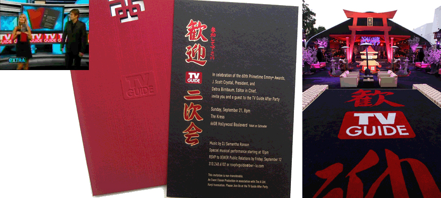
My second favorite project comes to mind simply for the glamor and grandeur. This was for TV Guide Magazine’s 60th Anniversary Emmy After Party. The invitation made such an impact that it was featured on a segment of the celebrity and entertainment news program Extra!. I am impressed with the huge carpet with my calligraphy beautifully done – I would have love to have seen this in person! As a consolation, though, many of my favorite television personalities did get to see it! The main character of the design is kangei with the kanji 歓迎 meaning Welcome.
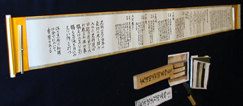
For the most difficult recent project, this was a makimono that detailed the waza for a ninjutsu school. I cannot talk much about it or show it any detail, but above is a picture of the finished scroll so you can get a feel for the detail and extent of the work. By the way, I have never shown this photo before.
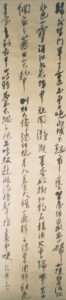 Eri Takase: The most significant change to my work certainly came when I moved to the US in 1994. In Japan I was still competing and belonged to a professional calligraphic society – so my art was strictly formal. I talk about this work in some detail at Traditional Japanese Calligraphy and I talk about what is involved in creating such a work in Hara: Master Calligrapher Eri Takase on the Art and Energy of Japanese Calligraphy. On the right is an example of a work that won best in category and was displayed at the Osaka Museum of Art and is now in my home. This is a formal poem by Sonpun that consists of 112 characters and is 20 3/4″W x 89 3/4″H – it is almost 8 feet tall.
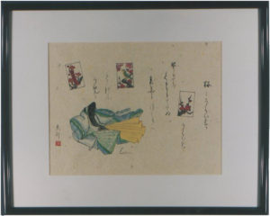
Traditional calligraphy does not allow for use of color – the paper, the style, everything has rigid guidelines. There is personal expression, of course, but within these rigid guidelines. But after moving to the US, I stopped and thought about the art I wanted to create – the art that I wanted to see – and what came out was the use of different papers, Western-stye papers, color and non-traditional topics. An example of this work was this playful depiction of my favorite game hanafuda:
Initially, I moved from Osaka to Charlottesville VA and since then have lived in Clearwater FL, Kaneohe HI and I now reside in the beautiful state of Washington. It is a long story. Each place provides a unique source of inspiration which I find from the natural setting around me and also from the people and lives I come in contact with. I still have so much to express through my art but over the years I have found myself more and more drawn to working with others so they may find their own personal expression. So I have done thousands of custom pieces – from scrolls and art – to custom tattoo designs. Each with a story to tell and many that are deeply personal. All works I would never have considered while still living and working in Japan.

With that said though one should not take away the idea that I am belittling my formal training – that is one of my most precious gifts. While I have explored new mediums, new tools, and new techniques, I still remain true to my roots in traditional Japanese calligraphy. My favorite expression is “onkochishin” or “respect the past, create the new” which means to me that one must study and learn what has come before – only when one masters this, masters the fundamentals, can one create something truly new.
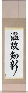 Respect the Past, Create the New
onkochishin
温故知新
Anime Reign: Who are your favorite calligraphy artists? Who do you look up to?
Eri Takase: Three artists come to mind: Ogishi (Wang Xizhi), Miyamoto Musashi, and Sakaki Bukuzan (aka Bakuzan Sensei)
Ogishi could be considered the father of Japanese calligraphy – the style he created is balanced and elegant. Most people might not list Ogishi as their favorite, this would be about as creative as saying George Washington is one’s favorite president. But his work was original and became the basis for much of the art that came later. For some examples see Ogishi.
Miyamoto Musashi (the master swordsman) was also an excellent calligrapher and artist. He embodies the discipline and philosophy that links both the Martial Arts and Japanese calligraphy. See Art of Miyamoto Musashi for some fine examples. He was known not only for his calligraphy but also for his art.
With Ogishi being the founder, Miyamoto Musashi a classicist and renaissance man, my third favorite is Bakuzan-sensei who was traditionally trained like myself but was able to push the envelope of the art and became more of an avant-garde calligrapher. There was great resistance to his work, but he was extremely popular and had a huge impact on the art. For examples of his work see Sakaki Bakuzan
Anime Reign: Is it possible to produce or make a calligraphy for a different place or culture ? If we talk about India, we have a huge and vast history consisting of various scripts and languages written on old monuments and old documents. They also count as calligraphy? How can we relate them to Japanese calligraphy?
Eri Takase: Absolutely. Though, I know very little of the particulars. I do recall Kouichi Honda who is a Japanese national doing Arabic calligraphy (see Japanese Artist Specializes in Arabic Calligraphy). Personally, I have done works using “bonji” which are Sanskrit characters that were adopted into Japanese when Buddhism was introduced.
This is not a very good photograph, but this is a Buddhist work I created. This is “senju kannon bosatsu” (Thousand Armed Kannon). The symbol in the upper right is a Sanskrit seed character read “kiriiku” or “kiri-ku“. I thought this a good example showing Sanskrit calligraphy (through Japanese lens) together with Japanese calligraphy.
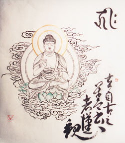
For some interesting background see Japanese Buddhist Statuary – Sanskrit Seed Syllables.
Anime Reign: There are many kinds of paper used in calligraphy. What kind is your favorite? And what would you suggest new artists to start with?
Eri Takase: Japanese calligraphy is done on a thin paper made of kozo, mitsumata or gampi — or some combination of these plant fibers. While I like all kinds of paper my preferences are papers made of kozo and mistumata.
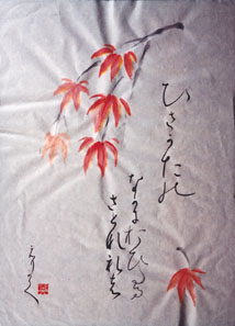
The problem with calligraphy paper is that it is thin and when the ink dries it will warp. Here is an example of this:
To turn this into art suitable for framing a process called “urauchi” is used. Briefly, the paper is sprayed with water to gently wet it, then another heavier paper is also sprayed and covered lightly with a fine glue. Then carefully the art is applied to the heavier paper and then brushed to get out all of the wrinkles. The result should be the art looking like it was done on this heavier paper. This takes a lot of practice and skill to do well.
Unfortunately, in the West, there are very few people that do urauchi so any art done on fine calligraphy paper will have these wrinkles. This is okay for practice, but if one want the work to look nice one pretty much needs to learn to back the paper oneself or else use a heavier Japanese paper, say about 50 g/m. Fortunately, there are several sources in the US that import these heavier Japanese papers.
When you look for a paper note that the sizing on the paper is different (it affects how the paper accepts the ink). The less sizing added to the paper the more the paper tends to blot when ink is applied. This is complicated by the fact that that the thinner the ink, the more blotting. So some experimentation is needed to get the right combination.
I talk more about this and show some samples and videos at Takase Shodokai Lesson 1 – Tools – this is also a good introduction for those looking to learn Japanese calligraphy basics.
For new artists, I strongly recommend finding a local teacher and using what they recommend. There is no universal truth in calligraphy so learning the basics from a good teacher means learning the ways of that teacher.