Traditional Japanese Calligraphy
You may be surprised to learn that all professional Japanese Calligraphers spend most of their time learning Chinese Calligraphy. In fact, Japanese Calligraphy is a superset that includes Chinese calligraphy. And for many competitions, the calligraphy is of classic Chinese verse which uses couplets or quatrains of four, five, or seven syllables. And these are large works with the pieces we show below measuring almost 90″ high by 21″ wide. That is 7.5 feet high!
Japanese calligraphy originated in China and even today the Japanese calligrapher is classically trained in Chinese Calligraphy as well as calligraphy that is unique to Japan which incorporates kana invented in Japan around the 6th century.
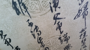
 The item on the right shows the original Chinese poem with a partial Japanese translation just to its left. In red are the notations made by the artist. These notations can represent a number of things. Often times the Chinese characters used in these poems are not used in modern Japanese. Also, Chinese has no phonetic alphabet for grammar but rather relies on more than several thousand Chinese characters. Japanese has two phonetic syllabaries, together called kana. Hiragana is used for grammatical elements, verb forms and some words and the other, katakana, is now used exclusively to rendered non-Japanese words and names into Japanese. Additionally, Japanese has about 3,000 characters called kanji which are Chinese characters adopted to write modern Japanese.
The characters for the poem are given in a Block (kaisho) script and must be converted to the target script. Master Takase prefers the cursive (sousho) scripts and so as one of the first steps in creating the art is to convert the characters. Cursive scripts are not taught in school and so most Japanese cannot read these but the characters are elegant, expressive and can be both strong and feminine.
The next step is to decide the layout of the work. For traditional calligraphy competitions, there are always compulsory elements which must exist in the art. These are nijimi (blotted area), kasure (patchy area), large and small characters, and thick and thin lines. The placement of each of these elements along with the beauty of the script defines the artistic value of the work. And there are other rules, for example, two blotted characters may not be next to each other.
It is the balance of these elements, perfection alongside seeming imperfections, that make a true work of art.
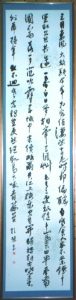
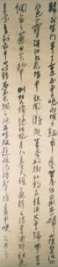
A western observer might see the blotting as a defect thinking that perhaps the calligrapher applied too much ink to the brush causing the ink to bleed into the paper. However, in traditional Japanese calligraphy, the work would be unacceptable without the nijimi. As it would be unacceptable without the kasure where it appears that the brush was running out of ink. This corresponds to the concept developed for the tea ceremony where the imperfection is as much a part of the artistic value as is the technical excellence. The piece on the left measures 20 3/4″W x 89 3/4″H. It is a combination of two poems by Ranjin of seven syllable couplets. The original text for the poem in Chinese with the Japanese translation is exactly what the calligrapher receives prior to starting the design. |
 A Poem by Ranjin
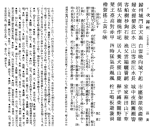
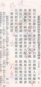
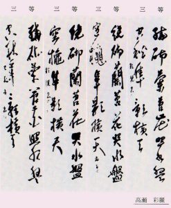
This next piece is a poem by Sonpun and is also of the seven syllable couplet style. It consists of 112 characters and like the above work measures 20 3/4″W x 89 3/4″H. These poems are Chinese classics. This poem, for example, is a narrative of a man visiting the city of Kishu. He talks of the river swelling after the snow of the harsh winter has thawed and of what he sees in the village. The detail of the artwork to the left is shown below in Chinese, in Chinese with the Japanese reading and finally with a Japanese translation. This is shown on the left. This is a partial translation of Sonpun’s poem: “The gates of Kishu castle stretch half–way to the sky with the white clouds of twilight surrounding the castle base. On the rugged mountain path, a lady carrying a jar goes to collect water. The snow from Mt. Hasan is disappearing, filling the rivers whose roar at night fills the castle. Passenger boats are lined in the shade of the trees by the corner rocks, fishermen’s drying nets are touched by the clouds. In the fields at the base of the mountain, farmers are harvesting, and large dried trees are being burned to make charcoal. The people of the land feed the dogs, capture wild deer, the children create an enclosure of brushwood and chase in pheasants…” (translation by T. Jackowski) This particular piece was chosen for an exhibition at the Apollo Museum of Arts in Osaka, Japan. |
 A Poem by Sonpun
Traditional Japanese calligraphy is both formalized and exact. While artistic expression and genius are necessary, they are confined within the technical excellence required by this very standardized art form.
Judging involves a panel of judges from the society. Typically there will be hundreds of entries and the judges will be presented with five separate works shown together on a very large board that is rolled in before the judges. The judges do not know who did each of the works, so for the most part, it is a completely blind judging. It is not perfectly so as artists that are better known will have a recognizable style. The panel of judges will choose one of the five works and that work will advance to the next round. This process continues until the final pieces are selected.
The two works shown here by Takase Sensei have won best of category awards in national competitions using this type of judging.
 Calligraphic Societies In Japan
There are many calligraphic societies in Japan as Japanese Calligraphy is an extremely popular hobby. Master Takase belonged to societies whose members were limited to calligraphy teachers and professional and who represented the very best in Japan.
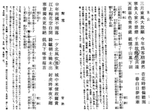
The work on the right is an excerpt from the register of Bokuteki-kai and shows one of Master Takase’s early work. This is a best in class awards for a national competition. Master Takase’s work is on the far right under her nom de plume Takase Sairei.
While this work is remarkably different from the others shown above, note the absence of color and of anything other than the Chinese characters on Japanese paper. Japanese calligraphy is a traditional art and the artist must work strictly within the rules. As an example, to add any color or sumi-e drawing to the work would mean instant disqualification. The rules for a competition generally go down to the type of paper and ink to use.
Very few calligraphers ever receive the honor of best in class and Master Takase has received this honor multiple times in two different and prestigious societies: the Bokuteki-kai and Bunka-shodo.
For further reading see California Reiki – An Interview with Master Takase. Here Master Takase discusses what it takes to create the large competition pieces.