Commercial Japanese Calligraphy
For almost two decades now Master Takase has been working with graphic designers, publishers, and editors to create custom Japanese Calligraphy designs to fit a product and market. No doubt you have seen her works in books, movies, ad campaigns, on the catwalk, the grocery shelf and even in computer games. In each case we work closely with our clients to create Japanese Calligraphy designs using a process of producing hand-brushed samples, getting feedback and making changes until the design is just right. Many times our clients have an idea of the feel that they want to convey and we work to turn this into concrete examples and, always, just the right design. If you are looking for beautiful designs and fast, courteous and professional treatment, we would love to work with you.
Licensing Options

Personal Use
For personal projects — gifts, home decor, personal websites, or other non-commercial use. No commercial rights transferred.
From $105

Non-Exclusive
For commercial products, publications, or marketing. Master Takase retains the right to license the same design to others.
From $135

Exclusive
Exclusive commercial rights — your design will not be licensed to anyone else. Ideal for branding and advertising.
From $350

Work for Hire
Full copyright transfer — you own the design outright. For projects requiring complete intellectual property rights.
Contact Us for QuoteThe Design Process
To create the best possible design you will be working directly with Master Takase and both native English and Japanese translators who will provide as much (or as little) documentation as you need to be comfortable with the translation.
Using your description, Master Takase will start by creating an initial set that includes translation options and sample designs that show how the translations might look in the design. Each design set, including this initial set, is hand-lettered by Master Takase. And with each set we are happy to provide you with as much documentation as you need to be completely comfortable with the translation.
With your feedback we should have a good idea of what is working well and will then incorporate your feedback into a new design set. We continue to work with you, showing designs with explanations and getting your feedback until the design is just right. Normally this takes two or three sets of designs.
We offer a variety of options for the delivery of the final product. The basic offering is for a hand-lettered design on flat, white, acid-free paper up to 5". This design can then be delivered digitally (in JPG, PSD, or TIFF formats) via email, or the original design can be mailed, or one can select both of these delivery options.
If you have any questions or if we may be of any assistance, please contact us.
Examples of Commercial Work
This page shows many representative projects and a brief list of some of the projects we have worked on over the years.
TV Guide's 60th Primetime Emmy Awards Party
Featuring Master Calligrapher Eri Takase's Artwork

Master Takase received national attention for her work with the marketing department of TV Guide that was featured for their 60th Primetime Emmy Awards Party. Her art was the centerpiece of the main display and the elegant invitations were so special they were featured on NBC's prime time entertainment show EXTRA.
Arla Foods — Product Packaging
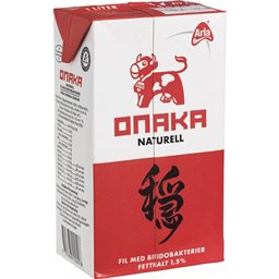
This design was developed with Anne-Marie Nordström, Product Coordinator and Stefan Lindros Design Director both with Volt Advertising Agency in Stockholm Sweden for Arla Foods. The kanji used is odayaka meaning calm or peaceful and is used on the package for a soy milk product.
We worked not only on the design but also on the word selection – One needs a translation that is correct and appealing, but it must also communicate visually. We were able to work with Volt to come up with just the right combination of elements.
Many credit Arla Foods for successfully creating a product brand with Japanese Calligraphy in Japan. And this was certainly no mean feat.
With the popularity of Japanese Calligraphy and kanji, advertising agencies are finding the need to work closely with artists on designs that will have an international appeal.
When one is looking at today's truly international marketplace, having an experienced calligrapher with a proven track record and products already in the marketplace is a must.
In case you are wondering, almost a decade after the initial design, the "odayaka" calligraphy is still popular and used in Sweden! Here is the latest version of the packaging – it still looks great and the calligraphy is instantly recognizable!
We would be delighted to work with your company to make a memorable design.
Onitsuka Tiger — Advertisement

Early in 2005 Eri Takase worked with Art Director Bill Stowe of Vitrorobertson on a project for Asics America Onitsuka Tigers Athletic Shoes. The design used was the Four Virtues of Tea read "wakeiseijaku" and is featured prominently in the upper left in a series of advertisements.
Mr. Stowe had the kanji to use from corporate but wanted an artistic rather than computer generated font. He knew he wanted a semi-cursive font and so Ms. Takase was able to quickly create a set of poignant options. The original design set that Ms. Takase came up with is as follows:

Mr. Stowe liked the thick brush strokes of design (5) and wanted to see other variation using this line weight. From this feedback a second design set was created:

The choice was obvious and from sample (7) the final designs were created that were used in the campaign. From initial design to approval took two days.
3Dmolds, Inc. — Product Design

I had the pleasure of working with 3Dmolds.com to create custom designs for their 3D mold products. Shown here are soap molds for the home crafts market.
"We will also be incorporating the calligraphy into other exciting products as well, including candle molds, and chocolate/candy molds."
Gilded Lily Perfume — Graphic Design
Earlier this year we were pleased to work with San Francisco perfumer Ineke Ruhland and her graphic design team of Helena Seo on the calligraphy for a new perfume: Gilded Lily. The schedule was extremely tight with the original request for calligraphy on Friday and the final calligraphy for the product and packaging delivered on Sunday.
If you are looking for world-class Japanese Calligraphy for your product or marketing material, we would love to work with you.
Jane Eamon — CD Cover

Singer/Songwriter Jane Eamon has released her new CD "Real". This is a beautiful album. To take a quote from her biography "Eamon's soulful, spiritual, and easygoing sound deftly combines elements of country, folk, blues, gospel and Celtic music."
"I wanted to capture the sound of Gordie and I playing live in the room with the love and energy that passes between us to be evident on the recording. I think we did it. The rough mixes sound like we're in the room."
The CD was designed by Scott Gamble and the calligraphy was created by Eri Takase. The calligraphy is a design of the word Storyteller which in Japanese is kōdanshi and is so appropriate for the storyteller Jane Eamon.
Ralph Rucci — Fashion

Eri Takase has collaborated on several designs for the fashion industry. The work that stands out in her mind as being exceptional was that done with Ralph Rucci using the kanji for "chadō" or "Tea Ceremony."
"Truly in the hands of a talented designer calligraphy can become magic. Designers that I have worked have time and again shown this to be the case, but in my mind there is no finer example than the marvelous work of Fashion Designer Ralph Rucci."

Between Two Souls — Book Illustrations
Between Two Souls: Conversations With Ryokan
Author: Mary Lou Kownacki
Cover Art by: Kevin van der Leek
Calligraphy by: Eri Takase
In 2004, Takase Studios was approached by Kevin van der Leek, Graphic Designer and owner of Kevin van der Leek Design Inc, to create custom calligraphy to complement the poems in Mary Lou Kownacki's Between Two Souls: Conversations With Ryokan which was being published by Sandra de Groot of Eerdmans Publishing Company. Takase Studios was tasked to read through the manuscript and prepare a series of designs that would complement the poems in the manuscript. A list was created along with Mr. van der Leek and from this a series of designs. This was later pared down to the final ten designs that were used in the book. From initial contact to the delivery of the final designs to the publisher's desk took ten days.
"Thank you, once again, for all your lovely work on Between Two Souls. It is doing very well and many comment on the beauty of the calligraphy."
— Sandra de Groot, Eerdmans Publishing Company

"This book is a magical exchange of poems between the ninth century Zen monk Ryokan and the twenty-first century Benedictine monk Mary Lou Kownacki. After reading Sister Kownacki's book I understood that I could not identify with Ryokan's poetry because I did not comprehend the depth of compassion behind his words. Sister Kownacki led me to this understanding and to that place where when deeds are from compassion then words become poetry."
— Master Japanese Calligrapher, Eri Takase
Meditations With Tea — Book Illustrations

Meditations With Tea: Paths to Inner Peace
Author: Diane Rosen
Calligraphy by: Eri Takase
For these designs we had the pleasure of working directly with the Author on the designs. We originally created seven designs, five of which were selected to use in the book. From initial contact to the work being mailed to the book designer Anne Ricigiano took four days.

In the above design we used a design for chawan meaning tea bowl or vessel. Ms. Rosen initially presented us with a short list of words she wanted. We offered several options for the translations and based on her feedback were able to narrow down the list of words and focus on the font.
Meditations With Tea: Paths to Inner Peace
Touhkondo — Book Cover

In 2010 Takase Studios was approached directly by author Deon L de Jongh for the cover calligraphy of his new book Touhkondo: "The Way of the Fighting Spirit". Mr. de Jongh was on a tight deadline. We had the first set of samples to him two days after first contact and the final designs at the publisher's office a few days later – all well ahead of schedule.

Touhkondo: "The Way of the Fighting Spirit"
Tattoo Sourcebook
Featuring Japanese Tattoo Designs by Master Eri Takase
Master Japanese Calligrapher Eri Takase has lent her hand to over forty original designs for Tattoo Sourcebook which is a compendium of modern designs by today's hottest tattoo artists.
Visit our Japanese Kanji Designs site for original designs by Master Takase – original designs available nowhere else. These carefully researched and beautifully hand-lettered designs come with the line art that your tattoo artist needs to ink the design.
Antahkarana: Celestial Fullness

"I just received Dr. Mikio Sankey's new book which features my calligraphy on the cover. The Chinese reading is 'tien man' and the Japanese is 'tenman' (among other readings)."
"If you are looking for Japanese calligraphy for your book or for other commercial uses I would love to work with you. My aim is to create calligraphy that matches the look and feel that you want. I am glad to offer advice and direction with my main goal being to create calligraphy that works best for you."
Eri Takase
Foundation Magazine

Worked with Mr. Shane Hoffman, Managing Editor/Art Director of Foundation Magazine on seven illustrations for an article by H. Paul Brehm that recounted the reunion of the battle resulting in the sinking of the Battleship-Carrier Hyuga in July 1945.
For this job, Mr. Hoffman sent us copies of both the article and the magazine. With this and with Mr. Hoffman's suggestions we created a list of words and phrases that blended with the narrative. We then worked with Mr. Hoffman on the font and size to come up with the final designs.
Because Takase Studios uses a native English speaking translator communication is seamless and effective.
Bonsai Today

In 2004 we worked directly with Bonsaist and author Michael Persiano on a name for a special bonsai. Mr. Persiano wanted the calligraphy to capture the permanence and majesty of this fine specimen.
CD Covers

Eri Takase's design for "Love (ai)" is featured on the CD cover of Jazz artist Tim Tamashiro.

Jazz artist Reed Kotler's Tomo CD subtly introduces the kanji for "tomo" which means "friends."
Film — The Creed

In 2003 Eri Takase worked with Director/Producer Adam ArNali of ArNaliFilms on artwork for his movie "The Creed".
"Thank you very much for putting your artistic touch on the film, it's been huge in getting people interested in the film." Adam ArNali

In 2001, along with nine others, Eri Takase was asked by Editor Jan Burney of John Brown Publishing Group to contribute to a concept magazine with the theme of "Words." The magazine was designed to explore ideas about design and human perception and was distributed throughout Europe and the US to creative directors, art editors, designers and their clients.
"Ten Celebrated artists, designers and academics were invited to create an image based on their favorite words/phrase."
"I selected these words to show that Japanese Calligraphy can express the coolness of a breeze, the caring of a mother, and the passion of love. As obtuse as an abstract work or as delicately detailed as an artists' brush could ever portray – Japanese Calligraphy brings to words a range of expression where words are the art."
— Eri Takase
The "Willow" symbol on the bottom of the work on the left was designed and crafted to match the exquisite tastes and style of the Willow Salon.
Tanuki Enterprises — Name Card

The name card on the left is for Tanuki Enterprises located in Altamonte Springs, Florida and which specializes in web design, database and business applications. The logo uses the Japanese Calligraphy of Eri Takase and consists of the kanji for tanuki 狸 using the Sousho Script inside of the Ensou (Circle).
Sky Yoga — Logo Design
In 2003, I had the pleasure of working with Yoga instructor and Reiki Master Ms. Ann Ford on a logo design for her business Sky Yoga. Working with Ms. Ford we created a design that fits her business.
Metro Open Karate Championship

This design is by graphic designer Kent Mummert of Clinton, MS for the Metro Open Karate Championship. This work uses Eri Takase's calligraphy in the semi-cursive font. The three categories listed in black from left to right are "Kata", "Kumite", and "Kobudo".
Japanese Calligraphy Designs Catalog


Takase Studios offers a large selection of Japanese Calligraphy Designs covering topics such as Inspirational Kanji Designs, Martial Arts Kanji Designs, Names in Japanese, Oriental Arts Kanji Designs, Christian Kanji Designs, and Romantic Kanji Designs. These hand-lettered designs by Master Takase can be instantly downloaded and are available in commercial use formats of 72 dpi, 300 dpi, and often 600 dpi JPG.
If you would like to order a custom calligraphic design or have any questions about licensing, please contact us and we would be delighted to work with you.