Section 1
1 Tools
2 Lines
3 永 ei
4 本 hon
5 自 ji
6 由 yuu
Section 2
7 主 shu
8 月 tsuki
9 花 hana
10 岩 iwa
11 友 tomo
12 目 me
Section 3
13 耳 mimi
14 手 te
15 米 kome
16 国 kuni
17 光 hikari
18 空 sora
Section 4
19 見 ken
20 天地 tenchi
21 春風 harukaze
22 克己 kokki
23 洗心 senshin
24 喜 ki
Section 5
25 ア a カ ka
26 サ sa タ ta
27 ナ na ハ ha
28 マ ma ヤ ya
29 ラ ra ワ wa
30 濁点 dakuten
Ritchie & Kathy
Names

Introduction
This introduction is an overview of the Takase Shodokai Series.
Several new words are introduced and for their proper pronunciation and spellings please visit the Dictionary of Calligraphy Terms.
Japanese Calligraphy is a lovely art and requires years of practice and dedication to master. English texts on the subject attempt to teach the basics, but they lack the movement required to teach proper technique and proper form. This is why we have selected to use multimedia lessons on CD-ROM which contains not only detailed explanations, samples, and frame by frame analysis, but also videos showing correct technique and audio giving proper pronunciation.
The first set of four CDs teach the basics of the kaisho font. Kaisho is a bold and precise style and is probably the most commonly seen font in the United States today. On average the student will need three months to complete all the lessons on each CD.
Following the kaisho font basics, a fifth CD dedicated solely to katakana will be presented. Katakana is an angular syllabary used today for writing non-Japanese words and non-Japanese names in Japanese. This will also contain extensive information on how names are translated to Japanese along with lists of names translated to Japanese.
The second set of four CD's will continue with more advanced techniques in the kaisho font.
On average a student will required two years to become adept in the kaisho font with each CD taking about three months to master. For the first two years a total of nine CDs will be required including the special CD on katakana.
Following this the lessons will turn to the gyousho font
(semi-cursive) and hiragana. These require different
fundamentals from the kaisho font: Where kaisho is stagnant, gyousho is flowing. Where
kaisho is precise, gyousho is flexible. Where
kaisho is angles, gyousho is curves.
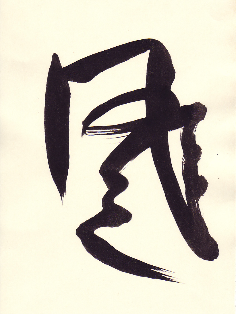
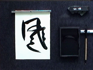
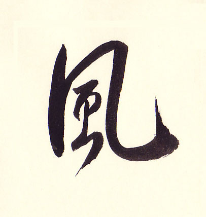
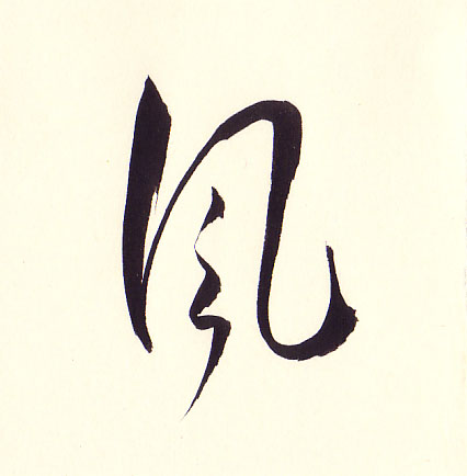
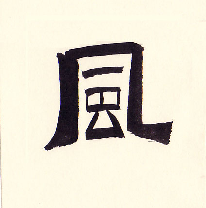
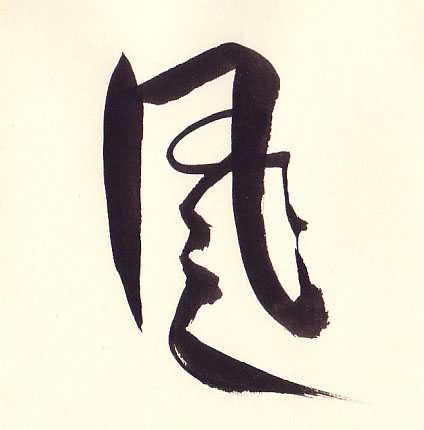
Below are samples of the Japanese word for wind in all of the major fonts. Wind
in Japanese is
kaze and
is written as 風 in kanji.
Here is an artistic rendition of kaze and following is a video of how it was created.
In the section we start with the Kaisho font and subsequent sections will cover each of the other major fonts. The Takase Shodokai Learn Japanese Calligraphy Series is a complete course that will take the beginning student through each level to mastery of the art. The following table shows the major font categories:
| Kaze (Wind) 風 in Six Fonts | ||
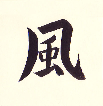 Kaisho (Block) |
 Gyousho (Semi-cursive) |
 Sousho (Cursive) |
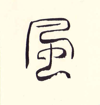 Tensho (Seal) |
 Reisho (Clerical) |
 Artistic |
Once we master the kaisho and gyousho fonts, we will delve into the uniquely Japanese cursive style called sousho and with kana called hentaigana. Before hiragana was formalized, kanji and kana were mixed in the cursive style. This is known today as hentaigana and is quite complex. Sousho takes the dancing motion of gyousho to another level of abstraction and fluidity with this font.
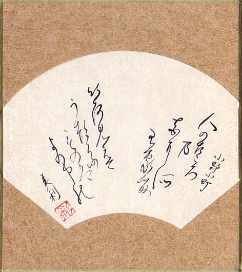
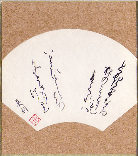
Examples of hentaigana and Kanji in the sousho font are shown below:
| Visible colors (Invisible passions) Fade from This world's Human hearts And flowers. |
hito no kokoro hana ni zo arikeru iro miede |
人の古々ろ農 花耳所 有家留 以呂見盈天 う都呂ふ 毛の盤 よの中能 |
|
Note: The order of the two verses are reversed in this work |
||
| The enduring
Verdure of the pines, That spring has come, Take on a green one shade beyond The color that was before. |
toki wa naru matsu no midori mo haru kureba ima hitoshi ho no iromasari keri |
と起半なる 松の三どり も 春久れ八 いまひとし本の 色まさり 介利 |
The other font that that we will explore is the tensho font. Tensho is important as students may eventually want to design and perhaps carve their own seal. We will cover the tensho font in detail in future lessons.
I encourage you to look at and surround yourself with good calligraphy. The works of the masters are certainly recommended and there are several on-line sources as well as books. Develop a taste for what appeals to you and what does not. It is important to develop an eye for good works.
For enjoyment the student will find this series to be rewarding and will be able to become proficient with the art. If one is looking to master the art, then Takase Shodokai will provide the CDs and resources necessary to take the student to the highest levels.
Copyright © 2017 Takase Studios, LLC. All Rights Reserved.